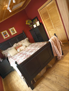
Corinna and Jamie Campbell were looking to expand on their cottage experience. “We wanted more space,” Jamie says, adding with a touch of wry humour “and I wanted a garage.” It was this desire that started the Campbells on their search for the perfect cottage.
Fortunately the task at hand was not an arduous one. While initially Corinna and Jamie had entertained the notion of acquiring a new plot of land upon which to build, the couple ultimately decided to keep their existing property. Jamie recalls, “We had looked around briefly for something new, but not for very long.” Not a difficult decision it would seem, given that since its purchase in 2003 the Campbells had created almost a decades worth of memories enjoying their immaculate property overlooking the picturesque shores of Three Mile Lake in Muskoka, Ontario.
With the location firmly established, the Campbells were able to focus primarily on what their new home-away-from-home would look like. Happily - almost serendipitously - due to a pre-existing working relationship with consultant Greg Alton at Home Hardware Building Centre in Milton, Ontario, all of the information Corinna and Jamie were seeking was readily accessible. Jamie notes, “We had worked with Home Hardware to redo the windows and kitchen at our home in Milton.” It was through these interactions that the Campbells had become aware of the many services and options that the Beaver Homes & Cottages Program offered in conjunction with Milton Home Hardware Building Centre.
After taking time to peruse the Beaver Home & Cottage Design Book, Corinna and Jamie agreed that the Copper Creek model was the option best suited to their needs. “We really liked how open the layout was, and we loved the floor plan.”
The Campbells were able to work closely with their trusted Home Hardware consultant alongside friends from the Muskoka area from the planning stages right on through the build. “I have a few contractor friends from the area whom I would have over to discuss different parts of the project.” Jamie says. “We made the floor plan larger; moving the front wall out 2’ and the side walls out 1’. There were alterations to the bedrooms, bathroom, and the master bedroom on the main floor.” Adding, “We changed the design to have larger bay windows in the back to take in the view of the lake.”
“Corinna had just given birth to our son,” Jamie points out fondly. “And though I did a lot of the work myself, I was confident in the quality of work being done by Home Hardware’s and other various contractors.” While spending time with their family, the Campbells recall that they never had to worry about the progress on the build. “Deliveries were being made on time, and everything was moving ahead.”
The progress continued unabated right up to the completion of the build. “Corinna and I worked together on all the finishing touches as well.” Jamie says. From the flooring and fixtures, to the lighting and siding, all aspects of the projects went as planned.
When asked about their overall experience, both Corinna and Jamie felt that the process and final product exceeded their expectations and that they wouldn’t have changed a thing. “We would do it all again,” adding that, “It was a lot of work, but we both really enjoyed it!”
As for the garage that Jamie was originally so emphatic about building: “I still don’t have it,” Jamie laughs. “We put it aside to focus on the complete cottage redesign.” With that in mind, and based on the glowing reviews of their experiences from concept to completion, it would seem that the perfect garage could be the next project for the Campbells, Milton Home Hardware Building Centre, and Beaver Homes & Cottages.
Monday, February 16, 2015
Monday, February 09, 2015
Beaver Home and Cottage Design Book
Beaverhomesandcottages.ca is a great resource to view and
research our collection of beautiful homes and cottages. You may however, prefer to leaf through a
physical copy of the 2015 Beaver Home and Cottage Design Book. The book is available at Home Hardware
Building Centres and Home Building Centres locations as well as on-line.
Tuesday, January 27, 2015
In Praise of Smallness: the "Not So Big" Cottage
Over and over, the reaction from browsers at Toronto's Cottage Life Show was the same. "How big is this?", followed by startled incredulity ("No WAY!") and the realization that bigger isn't necessarily better, "This is all we really need, we don't need it to be any bigger than this..."
Visitors believed their eyes, not the specs, when they walked into the petite 572 square foot model cottage available as a material package through Home Building Centres, says Dave Bond, Marketing Manager for Home Hardware's Package Sales division. The structure is furnished and finished only with materials and accents available through Home Hardware and Home Furniture stores - and it was the undisputed hit of the Cottage Life Show. "They were walking in, asking 'HOW big is this?'" Bond recalls. "It was like they were asking, 'Did I hear you right?!? I can't believe there' s only that many square feet in this cottage!'"
While the response to the Home Hardware cottage was overwhelming, the concept behind smaller space buildings is not a new one. Home Building Centres have carried smaller-sized packages for years, including the new line of bunkies in this publication. But with the popularity of books like American architect Sarah Susanka's The Not So Big House, which extols the virtue of smaller-as-better, designed for living houses, it's clear that consumers are thinking differently about the kind of space they want to live in.
Tim and Anastasia Hurley of Tillsonburg, Ontario couldn't agree more. The Hurleys actually purchased the model cottage from the Cottage Life Show. "We were there ourselves," as vendors, explains a thrilled Anastasia, "We had about half an hour before closing when we finally walked through. I walked through again, and again, and I said to Tim, 'What do you think about this, about putting this on our property?'" The couple scrapped their initial building plans and took the leap (and delivery) this past July. "I just absolutely fell in love with it, the colours were beautiful - it was just everything we wanted!"
Neatly blending form and function, the cottage begins with a generous entryway with lots of room for the things of outdoor living and family: shoes, towels, toys and coats. To the right of the foyer is a compact but complete bathroom featuring a roomy shower and space-saving vanity sink with plenty of storage. The high tech "sun tube" skylight brightens the room and provides excellent light on even the dullest of days. Like the building itself, the bathroom is small but doesn't feel it, thanks to good design and well-placed amenities.
What really catches your eye when you walk in the door, however, is the spacious and welcoming "great room", which stretches away and up, giving a tremendous sense of bright, open space. "Things like skylights, larger windows, vaulted ceilings... they just give you that little bit extra," explains Bond. The designers also used the same high quality laminate flooring throughout, "By not breaking up open areas with different kinds of flooring, you're allowing the eye wander uninterrupted."
The open-concept living space also includes a kitchen with storage for wine and other essentials under its large and versatile angled dining counter and bar area - perfect for accommodating gatherings of friends and family or an intimate dinner for two. The layout of the working surfaces relies strongly on principles of good kitchen design; everything is within reach, and there's lots of room for more than one cook. "Angling things off as opposed to squaring things off, these are things that make areas look larger than they are," Bond points out.
With just one bedroom, the cottage plan was developed with empty-nest boomers in mind. "People who are looking for something a little higher-end to retire to, or those who want a cottage or guesthouse, but don't want something that's overwhelming," a big bonus for anyone who's ever considered the reality of maintaining two homes. "This was the second time we took a completely 100% finished cottage to the show," he continues. "We wanted to do it with quality finishes; we wanted to show off the variety of products that Home Hardware carries - the fact that we really have everything you need." As it turns out, that decision appealed to many, "People called, saying they wanted to build the cottage, but that they also wanted the exact same flooring and roofing and other finishes," Bond says, smiling.
For the décor and interior design, Home Building Centres turned to the experts at Beauti-Tone. Bev Bell, Beauti-Tone Creative Director, Paint and Home Products Division, and regular décor and DIY columnist in Home Hardware's Home at Home magazine, worked her usual magic with stunning results. "We piggybacked on the wonderful warm wood," that panels the interior, explains Bell. "We made sure the colours all related, so they told a nice story; there's flow from one space to the next, it isn't jumpy." Done in deep, rich tones, the rooms are welcoming and inviting while still maintaining the sense of space and light that makes the cottage so livable. Even the stylish and well-priced, quality furnishings were provided by Home Furniture. "Everything in this model is available from us," Dave Bond states proudly. "This project was truly a collaborative effort among the experts at Home."
Tuesday, January 20, 2015
A Custom Home in a Premium Package
Chris and Karen Brennan had been looking for months for a country property outside of Brantford, Ontario. They did not need a large home, just one big enough for them and their two cats with a shed for their boat. They had lived in a small bungalow in Brantford and were eager to relocate to the open space of the country.
They eventually found exactly the land that they were looking for; a three-acre, tree-lined property with a century-old farmhouse and shed in Brant County, Ontario. But closer examination of the house revealed "it was just too far gone," recalls Chris. They decided to have the house demolished and build from scratch. Thus, started their search for the perfect home.
Chris picked up a copy of the Beaver Home and Cottage Design book and found a floor plan for a package home that fit their desire for a home with country charm. "We wanted to live in the country and I wanted a country-looking home. The front porch is what attracted me," explains Karen Brennan on her appeal to the Fulmore model.
With a model from the Beaver Design Book in mind, the Brennan's met with Ted Costen, Home & Cottage Design Consultant at J & K Home Building Centre in Brantford to inquire about building a package home. The fact that Chris could be his own general contractor and oversee all the sub-trades but to also have Ted to guide him through the process, should he need it sealed the deal. As owner of a heating & air conditioning company in Brantford, Chris had been working in the residential and commercial construction business for 15 years and knew a lot of sub-trades. Karen recalls, "Chris really wanted to build his own house. With Ted's help, this was a way to do it ourselves."
The reasonable cost of the package home was also a factor for the Brennans on their decision to build. Chris also liked the security of knowing that the original quote would not change: "The price is locked in after the deposit. I was able to build in our budget." He recalled that the cost of plywood almost doubled during the construction process of his home but it did not affect his cost because the price had already been locked in.
Budget is one topic that Ted stresses during his first meeting with potential customers. "I preach about budgeting," says Ted. "Most of us build at the top end of our budgets so there are no room for surprises." One of the biggest advantages to building a package home is the guaranteed price. Ted continues, "You are given one price and that is the price. The price is frozen."
Chris and Karen were drawn to the home's covered veranda stretching the length of the front of the home. The interior was perfect in size for the two of them but they approached Ted about customizing the plan to better suit their needs. "Ted had some really good ideas. Whatever we wanted, he'd do," says Chris.
Ted sat down with Chris and Karen to listen to their ideas on what they wanted in a layout and then came up with suggestions. The Brennans did not need three bedrooms so the plan was altered to make two larger bedrooms. The living room and the kitchen were flipped from the original plan. A large picture window in the living room allows additional light and a great view of the couple's large backyard. Ted recommended vaulted ceilings and numerous pot lights to highlight the openness of the spacious kitchen, living room and dining room areas. The staircase to the basement was moved from the center of the house to the end of the hallway. A half bath and a 1 1/2 car garage were also an addition to the original plan. Four large symmetrical windows were added in the enlarged guest bedroom enhancing the front exterior. Two sidelight windows transform the front entrance. The Brennans also decided to brick the entire exterior of the home.
Acting as his own general contractor, Chris hired everyone from framers, drywallers, to plumbers, to bricklayers and was in charge of overseeing all of the sub-trades. He praised the scheduling and delivery of materials: "Materials were always on time."
While most customers hire their own general contractor, Ted tells his customers that if they decide to be the general contractor of a project he can be involved in every step of the building process. He says, "I see myself as a service man. They [the customer] need services and I'll help them get whatever they are looking for. They know that I will be there for them."
As a sub-contractor himself, Chris has seen a lot of variance in residential construction quality. One of the reasons he was so impressed with Home's material packages is the quality of blueprints and materials. "It is premium," says Chris of the quality of construction. He points out that package homes are built to meet or exceed the National Building Code of Canada. "When people hear a 'package home' they may think it is lesser of a home," continues Chris. "It is not a 'kit' home. It is really a custom home with a material package."
"There are things that make the difference between an ordinary house and an extraordinary house," adds Ted. "You want to build the standard for tomorrow, not for today."
Tuesday, January 13, 2015
A Flawless Fit
Cory and Natalie Kaun were shopping for their own home, in which Cory, a welder by trade, planned to oversee the building of. Driving around their Red Deer, Alberta neighbourhoods, they noticed the familiar red, white and yellow logo on the majority of new homes going up. “It seemed like everyone was using Home Hardware,” says Cory, “so we thought we’d go see about a quote.”
Little did they know, that the initial visit with Tim Johnston, Building Consultant and Estimator at the Executive Home Building Centre, would result in a lot more than just their own home. It would lead the young couple into realizing a dream they’d shared since high school of starting their own business, Larkaun Homes.
“Our house just went flawless. It went up with no problems. And Natalie and I enjoyed doing it,” says Cory. Six months later they were back in Tim’s office and as Tim fondly says, “We’ve just been going ever since.”
Since Cory was still welding at night and Natalie was finishing degrees in massage therapy and pharmaceuticals, they couldn’t have gone into the construction business without Home’s help, says Cory. “It all comes down to the packages. They make life a lot easier. It’s one-stop shopping.”
Tim agrees: “They buy everything they can from us with the package ... framing lumber ... finishing lumber ... windows and doors and roof trusses and floor systems.” For Cory that provides peace of mind in knowing both the bottom line and that it won’t budge. “With the crazy market that we’re in, any given day the costs can be driven up. But Home’s material packages lock in. They guarantee their prices until the project is complete,” says Cory.
And for two young entrepreneurs in their mid-20s having the solid reputation of Home Building Centre backing you up also comes in handy. Especially in thebeginning, Cory laughs, when “people look at you and say, ‘You’re the boss?”
A dozen or so houses later (Cory’s lost count, but Tim guesses in the 15 to 20 range) and Larkaun Homes was ready to take on a bigger challenge. “Natalie and I owned this higher end lot that we wanted to do something special with.” Flipping through the pages of the Beaver Home & Cottage Design Book they came across the Lake Louise. With just a few minor tweaks to the floor plan it was exactly what they’d been looking for.
Making changes is welcome, even encouraged, says Tim, so that clients get exactly what they want out of their home. “You can flip through this book and take any plan you want and start drawing lines on it and say I want to do this, and I want to do that. Every home has the potential to be a custom home.”
Because of the size of the lot, Cory and Natalie felt the Lake Louise should be done on a grander scale. We wanted to blow up the square footage and give (a potential buyer) more value for their money.” Two feet were added to the bedrooms and another four to increase the kitchen and garage area. The revised plans were sent to Architectural Solutions at the Home Hardware head office in St. Jacob’s, Ontario, where the changes were made to code, and then sent back in a full set of blue prints.
In the open-concept, cathedral-ceiling upper floor, Natalie insisted the hardwood be installed on a 45-degree angle. “It adds a lot of character. Because the room is so big, it gives it a bit of direction,” she says of the unorthodox yet eye-catching effect. The maple kitchen cabinets are an inventive mix of dark and light stains. And the living room focal point, a homey gas fireplace, is rocked in from floor to ceiling. “It is called the Lake Louise. You’ve got to have a little stone in there,” laughs Natalie.
The first thing everyone notices when they walk in the door, however, is theacid-etched concrete flooring in the front entrance, bathrooms, mudroom and basement. A lustrous, swirling pattern of mottled dark and light browns with flecks of charcoal, “they’re gorgeous,” raves Tim. And heated, adds Natalie, for those who fear cold feet.
But it’s the David and Goliath partnership between Executive Home Building Centre and the Kauns that gives the Lake Louise, and other Larkaun-built homes their solid foundation. “We have a special relationship. They take care of us and we look after them,” says Cory. And the customer reaps the rewards of this relationship, says Tim. “From the blueprint stage right down to if there’s a problem because paint won’t stick to a baseboard,” Home Building Centres stand behind their material packages.
“We’re (Home Hardware Stores Limited) the big corporation - with what I think is an excellent reputation - and Larkaun Homes is the young up and comer. They’re putting their imagination to the plans. The combination of the two is building some pretty nice houses in town,” says Tim. And the Lake Louise is a perfect example of every package home’s potential. “They’ve basically taken our plans to the next level. We can tell our customers if you want to see what can be done, here’s the design book, go drive by the house.”
While Cory and Natalie didn’t have a buyer in mind while building the Lake Louise, they didn’t have to wait long. A month before it was finished, the very first couple to view the bungalow made an offer, enthuses Cory. “They just came along and said we’ll take it.”
The basement was unfinished in the original plan so Cory and Natalie designed a theatre room, games room and bar in addition to another bedroom and bathroom. And rather than brick they chose a stone tile trim for the exterior of the house. But what really makes it stand out from the others on the block is the interior design. Which is all Natalie, says Cory. “When it comes to colour and flooring ... she puts the flash on the homes.”
Little did they know, that the initial visit with Tim Johnston, Building Consultant and Estimator at the Executive Home Building Centre, would result in a lot more than just their own home. It would lead the young couple into realizing a dream they’d shared since high school of starting their own business, Larkaun Homes.
“Our house just went flawless. It went up with no problems. And Natalie and I enjoyed doing it,” says Cory. Six months later they were back in Tim’s office and as Tim fondly says, “We’ve just been going ever since.”
Since Cory was still welding at night and Natalie was finishing degrees in massage therapy and pharmaceuticals, they couldn’t have gone into the construction business without Home’s help, says Cory. “It all comes down to the packages. They make life a lot easier. It’s one-stop shopping.”
Tim agrees: “They buy everything they can from us with the package ... framing lumber ... finishing lumber ... windows and doors and roof trusses and floor systems.” For Cory that provides peace of mind in knowing both the bottom line and that it won’t budge. “With the crazy market that we’re in, any given day the costs can be driven up. But Home’s material packages lock in. They guarantee their prices until the project is complete,” says Cory.
And for two young entrepreneurs in their mid-20s having the solid reputation of Home Building Centre backing you up also comes in handy. Especially in thebeginning, Cory laughs, when “people look at you and say, ‘You’re the boss?”
A dozen or so houses later (Cory’s lost count, but Tim guesses in the 15 to 20 range) and Larkaun Homes was ready to take on a bigger challenge. “Natalie and I owned this higher end lot that we wanted to do something special with.” Flipping through the pages of the Beaver Home & Cottage Design Book they came across the Lake Louise. With just a few minor tweaks to the floor plan it was exactly what they’d been looking for.
Making changes is welcome, even encouraged, says Tim, so that clients get exactly what they want out of their home. “You can flip through this book and take any plan you want and start drawing lines on it and say I want to do this, and I want to do that. Every home has the potential to be a custom home.”
Because of the size of the lot, Cory and Natalie felt the Lake Louise should be done on a grander scale. We wanted to blow up the square footage and give (a potential buyer) more value for their money.” Two feet were added to the bedrooms and another four to increase the kitchen and garage area. The revised plans were sent to Architectural Solutions at the Home Hardware head office in St. Jacob’s, Ontario, where the changes were made to code, and then sent back in a full set of blue prints.
In the open-concept, cathedral-ceiling upper floor, Natalie insisted the hardwood be installed on a 45-degree angle. “It adds a lot of character. Because the room is so big, it gives it a bit of direction,” she says of the unorthodox yet eye-catching effect. The maple kitchen cabinets are an inventive mix of dark and light stains. And the living room focal point, a homey gas fireplace, is rocked in from floor to ceiling. “It is called the Lake Louise. You’ve got to have a little stone in there,” laughs Natalie.
The first thing everyone notices when they walk in the door, however, is theacid-etched concrete flooring in the front entrance, bathrooms, mudroom and basement. A lustrous, swirling pattern of mottled dark and light browns with flecks of charcoal, “they’re gorgeous,” raves Tim. And heated, adds Natalie, for those who fear cold feet.
But it’s the David and Goliath partnership between Executive Home Building Centre and the Kauns that gives the Lake Louise, and other Larkaun-built homes their solid foundation. “We have a special relationship. They take care of us and we look after them,” says Cory. And the customer reaps the rewards of this relationship, says Tim. “From the blueprint stage right down to if there’s a problem because paint won’t stick to a baseboard,” Home Building Centres stand behind their material packages.
“We’re (Home Hardware Stores Limited) the big corporation - with what I think is an excellent reputation - and Larkaun Homes is the young up and comer. They’re putting their imagination to the plans. The combination of the two is building some pretty nice houses in town,” says Tim. And the Lake Louise is a perfect example of every package home’s potential. “They’ve basically taken our plans to the next level. We can tell our customers if you want to see what can be done, here’s the design book, go drive by the house.”
While Cory and Natalie didn’t have a buyer in mind while building the Lake Louise, they didn’t have to wait long. A month before it was finished, the very first couple to view the bungalow made an offer, enthuses Cory. “They just came along and said we’ll take it.”
The basement was unfinished in the original plan so Cory and Natalie designed a theatre room, games room and bar in addition to another bedroom and bathroom. And rather than brick they chose a stone tile trim for the exterior of the house. But what really makes it stand out from the others on the block is the interior design. Which is all Natalie, says Cory. “When it comes to colour and flooring ... she puts the flash on the homes.”
Subscribe to:
Posts (Atom)