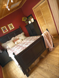
 Over and over, the reaction from browsers at Toronto's Cottage Life Show was the same. "How big is this?", followed by startled incredulity ("No WAY!") and the realization that bigger isn't necessarily better, "This is all we really need, we don't need it to be any bigger than this..."
Visitors believed their eyes, not the specs, when they walked into the petite 572 square foot model cottage available as a material package through Home Building Centres, says Dave Bond, Marketing Manager for Home Hardware's Package Sales division. The structure is furnished and finished only with materials and accents available through Home Hardware and Home Furniture stores - and it was the undisputed hit of the Cottage Life Show. "They were walking in, asking 'HOW big is this?'" Bond recalls. "It was like they were asking, 'Did I hear you right?!? I can't believe there' s only that many square feet in this cottage!'"
While the response to the Home Hardware cottage was overwhelming, the concept behind smaller space buildings is not a new one. Home Building Centres have carried smaller-sized packages for years, including the new line of bunkies in this publication. But with the popularity of books like American architect Sarah Susanka's The Not So Big House, which extols the virtue of smaller-as-better, designed for living houses, it's clear that consumers are thinking differently about the kind of space they want to live in.
Tim and Anastasia Hurley of Tillsonburg, Ontario couldn't agree more. The Hurleys actually purchased the model cottage from the Cottage Life Show. "We were there ourselves," as vendors, explains a thrilled Anastasia, "We had about half an hour before closing when we finally walked through. I walked through again, and again, and I said to Tim, 'What do you think about this, about putting this on our property?'" The couple scrapped their initial building plans and took the leap (and delivery) this past July. "I just absolutely fell in love with it, the colours were beautiful - it was just everything we wanted!"
Neatly blending form and function, the cottage begins with a generous entryway with lots of room for the things of outdoor living and family: shoes, towels, toys and coats. To the right of the foyer is a compact but complete bathroom featuring a roomy shower and space-saving vanity sink with plenty of storage. The high tech "sun tube" skylight brightens the room and provides excellent light on even the dullest of days. Like the building itself, the bathroom is small but doesn't feel it, thanks to good design and well-placed amenities.
What really catches your eye when you walk in the door, however, is the spacious and welcoming "great room", which stretches away and up, giving a tremendous sense of bright, open space. "Things like skylights, larger windows, vaulted ceilings... they just give you that little bit extra," explains Bond. The designers also used the same high quality laminate flooring throughout, "By not breaking up open areas with different kinds of flooring, you're allowing the eye wander uninterrupted."
The open-concept living space also includes a kitchen with storage for wine and other essentials under its large and versatile angled dining counter and bar area - perfect for accommodating gatherings of friends and family or an intimate dinner for two. The layout of the working surfaces relies strongly on principles of good kitchen design; everything is within reach, and there's lots of room for more than one cook. "Angling things off as opposed to squaring things off, these are things that make areas look larger than they are," Bond points out.
With just one bedroom, the cottage plan was developed with empty-nest boomers in mind. "People who are looking for something a little higher-end to retire to, or those who want a cottage or guesthouse, but don't want something that's overwhelming," a big bonus for anyone who's ever considered the reality of maintaining two homes. "This was the second time we took a completely 100% finished cottage to the show," he continues. "We wanted to do it with quality finishes; we wanted to show off the variety of products that Home Hardware carries - the fact that we really have everything you need." As it turns out, that decision appealed to many, "People called, saying they wanted to build the cottage, but that they also wanted the exact same flooring and roofing and other finishes," Bond says, smiling.
For the décor and interior design, Home Building Centres turned to the experts at Beauti-Tone. Bev Bell, Beauti-Tone Creative Director, Paint and Home Products Division, and regular décor and DIY columnist in Home Hardware's Home at Home magazine, worked her usual magic with stunning results. "We piggybacked on the wonderful warm wood," that panels the interior, explains Bell. "We made sure the colours all related, so they told a nice story; there's flow from one space to the next, it isn't jumpy." Done in deep, rich tones, the rooms are welcoming and inviting while still maintaining the sense of space and light that makes the cottage so livable. Even the stylish and well-priced, quality furnishings were provided by Home Furniture. "Everything in this model is available from us," Dave Bond states proudly. "This project was truly a collaborative effort among the experts at Home."


